Quantcast
Channel: Tenth Letter of the Alphabet
Viewing all 672 articles
Browse latest View live

Anatomy of a Logo: Will to Power

0
0

Will to Power was a twelve-issue limited series published by Dark Horse Comics. The editors were Jennie Bricker and Marilee Hord but I don’t recall which one called me, on February 16, 1994, about the logo. After a brief overview of the comic and the deadline, I received the fax of the logo designs produced by the in-house staff.


The next day I sketched out a few designs on scraps of craft paper.


A week earlier I had delivered the Jack of Hearts logo to Marvel, and I was working on the Great Grimmax logo for Defiant when I accepted the Dark Horse job. On February 19, I did a few thumbnail sketches.


I spent most of Monday morning, February 21, developing three designs. Two designs had some of the blockiness of faxed logos. 


The main challenge was how to integrate the fist and lightning bolt with the title. On the third design I moved the fist and lightning bolt below POWER and combined the angles of the lightning bolt with the O and E.


Next, I did the first of three stages of refining. Using a Rapidograph pen and tracing paper, I did slightly tighter versions of the sketches, then added red guidelines.


Detail of the top sketch.


Here is the second stage tracing...


…and the third tracing. The red bracket on the bottom logo meant that I should move TO slightly left to close the gap.


In the afternoon I made a photocopy and faxed it to Jennie or Marilee.


On Tuesday afternoon we discussed the designs. Number three was chosen and I was told to make the outline bolder. The next day I accepted two logos, Wraitheart and Mode Extreme, from Marvel. Starting on Thursday, I used a copier to enlarge the design then added guidelines.


The photocopy was taped to a light box and a sheet of LetraMax placed over it. The inking was done using a T-square, adjustable triangle, and a variety of ellipse templates. Corrections were made by scratching away ink. The logo measured 4.56 by 12.31 inches / 11.59 by 31.27 centimeters.


Friday afternoon I faxed the logo to Dark Horse and it was approved. The next day the finished art was sent by Federal Express.

Sometime later, I received copies of the first issue. The logo had been modified: a serif was added to the R, which, sort of, made the logo symmetrical. In the early stages of the design, I had considered adding that serif to the R, but in my mind it din’t look right, so it never made it in the sketches. In the logo, the right hand is holding the lightning bolt, but on Titan’s costume the left hand has it.


The remaining covers can be viewed at the Grand Comics Database.

(Next post on Monday: 1980s J.R.R. Tolkien Calendars)

Under Cover: 1980s J.R.R. Tolkien Calendars

0
0

Ballantine Books had the license to published the J.R.R. Tolkien calendars, which had illustrated scenes from The Hobbit, The Fellowship of the Ring, The Two Towers, and The Return of the King. In 1983, the production manager, Fred Dodnick, invited me to design the 1984 calendar. The cover, and subsequent ones, was designed by in-house art director, James Harris. Below are the calendars I worked on during the 1980s. Color comps of the title page and grid designs were submitted for approval.


The 1984 J.R.R. Tolkien Calendar
Illustrated by Roger Garland

Cover detail

The font, Tintoretto, was used in the marker comp.

Pencil sketch of the grid.

The printed grid with a detail of the illustration
behind the first letters of the month.


The 1985 J.R.R. Tolkien Calendar
Illustrated by Inger Edelfeldt

Cover detail

The font, ITC Zapf Chancery, was used for the title page.
I outlined the title and credit on tracing paper, then it was
placed on a light box for rendering.

Paper was placed over it and a marker comp was made.

Grid design with the fonts Bradley...

...and ITC Zapf Chancery.


The 1986 J.R.R. Tolkien Calendar
Illustrated by Michael Hague

Cover used ITC Zapf Chancery from
the 1985 calendar; cover detail.

Preliminary designs

ITC Berkeley Oldstyle was used for the title page.

A photocopy was hand-colored.


The 1987 J.R.R. Tolkien Calendar
Illustrated by Alan Lee, Roger Garland,
Ted Nasmith, and John Howe

Cover font is Cochin Black Italic; cover detail.

Title page font, Fancy Celtic, was from Photo-Lettering;
detail from the One Line Manual of Styles (1971).

The rubber cement-stained first grid design and...

...second design with two font choices for the month.
Four different ornaments were used in the corners of the
grid; the one in the lower right-hand corner was chosen by
the editor (noted in red) to be used in the printed calendar.


The 1988 J.R.R. Tolkien Calendar
Art by Ted Nasmith, John Howe, Roger Garland,
and J.R.R. Tolkien

Cover font is Bradley except for the large T and C
which are a different font; cover detail.

The font, Tarragon, was used for the title page.

Grid design with the font, Devinne Ornament,
was rejected by the editor.

Revised design with the Tarragon font.


The 1989 J.R.R. Tolkien Calendar
Art by Roger Garland

Cover detail

Title page font, Columna Open, was from Photo-Lettering;
detail from the One Line Manual of Styles (1971).

Two grid designs

Detail of untrimmed page.

(Tomorrow’s post: 1990s J.R.R. Tolkien Calendars)

Under Cover: 1990s J.R.R. Tolkien Calendars

0
0

(Continued from yesterday’s post on the 1980s calendars.) Ballantine Books had the license to published the J.R.R. Tolkien calendars, which had illustrated scenes from The Hobbit, The Fellowship of the Ring, The Two Towers, and The Return of the King. Below are the calendars I worked on during the 1990s. Color comps of the title page and grid designs were submitted for approval.


Art by Ted Nasmith

Cover font was Blackmoor; cover detail

Custom alphabet for the title page and months was used
first on the Exotica calendar of Olivia De Berardinis art.


The 1991 J.R.R. Tolkien Calendar
Art by John Howe

Cover font was Aquitaine Initials Std
with variant characters; cover detail

Title page font, Halifax, was from Photo-Lettering;
detail from the One Line Manual of Styles (1971).


Rubber cement-stained comp of the grid


The 1992 J.R.R. Tolkien Calendar
Art by Ted Nasmmith

Cover detail

The editor wanted the design to be consistent throughout
this calendar and subsequent ones.


Art by Alan Lee

Cover detail

Rubber cement-stained comp of the grid

Art by Michael Kaluta

Cover font is Fantaisie Artistique which was
from Photo-Lettering; cover detail.

Detail from the One Line Manual of Styles (1971)


(Next post on Monday: A Dark Traveling)

Under Cover: A Dark Traveling

0
0

Illustrations by Lebbeus Woods
David Harris, Series Editor
A Byron Preiss Book
Walker & Company, 1987
The second book in the Millennium series.

I chose two elements from A Dark Traveling, parallel worlds and
the moon, and gave them graphic form for the chapter dividers.

Dust jacket detail

Title page art

Prologue

Chapter 1


Chapter 2

Chapter 3

Chapter 4

Chapter 5


Chapter 6

Chapter 7


Chapter 8


Chapter 9


Chapter 10

Chapter 11

Chapter 12


Also by Lebbeus Woods, The Sentinel

(Next post February 9: Irv Watanabe)

Creator: Irv Watanabe

0
0

HITOSHI IRVING “IRV” WATANABE
February 10, 1919, Maui, Hawaii – January 1993, Hawaii


1920 United States Federal Census
Name: Hitoshi Watanabe
Age: 11/12 [11 months]
Birth Year: abt 1919
Birthplace: Hawaii
Home in 1920: Makawao, Maui, Hawaii Territory
Race: Japanese
Gender: Male
Relation to Head of House: Son
Marital Status: Single
Father’s Name: Hiroshi Watanabe
Father
s Birthplace: Japan
Mother
s Name: Some Watanabe
Mother
s Birthplace: Japan
Household Members:
Name / Age
Hiroshi Watanabe / 32 [Laborer / Sugar Plantation]
Some Watanabe / 33 [Laborer / Sugar Plantation]
Hiroko Watanabe / 03 1/12
Hitoshi Watanabe / 00 11/12

1930 United States Federal Census
Name: Hitoshi Watanabe
Gender: Male
Birth Year: abt 1919
Birthplace: Hawaii
Race: Japanese
Home in 1930: Makawao, Maui, Hawaii Territory
Marital Status: Single
Relation to Head of House: Son
Father
s Name: Hiroshi Watanabe
Father
s Birthplace: Japan
Mother
s Birthplace: Japan
Occupation: [blank]
Education:
Military Service:
Rent/home value:
Household Members:
Name / Age
Hiroshi Watanabe / 41 [Widower; Owner / Sugar Farm]
Hiroko Watanabe / 13
Hitoshi Watanabe / 11
Saburo Watanabe / 09


Guidebook for Homemaking in Hawaii
Caroline Wortmann Edwards
M.J. Fortie, Editor
New Freedom Press, 1938
Drawings by Hitoshi Irving Watanabe, Commercial Art Student and Graduate, McKinley High School, Honolulu (approximately 150 drawings)


Catalog of Copyright Entries, Part 1, Books, Group 1, 1938 New Series, Volume 35, Number 11
Edwards, Caroline Wortmann. Guidebook for homemaking in Hawaii, by C. W. Edwards. Edited by M. J. Fortie. Drawings by Hitoshi Irving Watanabe. © Feb. 28, 1938; 2 c. Aug. 22: aft. Oct. 24; A 122301; New freedom press, Honolulu, Hawaii. 14348

1940 United States Federal Census
Name: Hitoshi Watanabe
Temporarily Absent: Yes
Age: 21
Estimated Birth Year: abt 1919
Gender: Male
Race: Japanese
Birthplace: Hawaii
Marital Status: Single
Relation to Head of House: Son
Home in 1940: Paia, Maui, Hawaii
Street: Store Camp
Occupation: [blank]
Sheet Number: 11A
Household Members:
Name / Age
Hiroshi Watanabe / 50 [
Widower; Foreman / Sugar Cane Plantation]
Hitoshi Watanabe / 21
Hiroko Watanabe / 23
Katsuko Watanabe / 12

Brooklyn Daily Eagle (New York), July 21, 1941: Golf scores: Van Cortlandt—...Irv Watanabe, 69...


Biro-Wood Staff Christmas Card, 1942from Joe and Jim Simon’s The Comic Book Makers (2003)
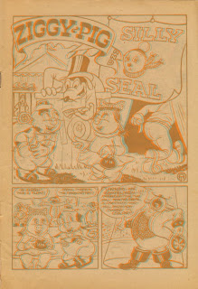

Daredevil Comicsart and lettering for “The Little Wise Guys Scrap Book”

#109, April 1954 (attributed to Watanabe)
#112, July 1954 (signed)

The Comics Journal, #282, April 2007
Fred Guardineer was interviewed and said: “…I did a lot of work for Charley Biro and Bob Wood in their crime comics. All their lettering was done by a guy of Japanese descent named Irv Watanabe. He was an excellent letterer. He lettered all of their books, including mine. I used to get the story and then I’d draw the thing up in pencils the best I could. I would letter roughly, so you knew how much space it took up. Then I would turn, what they called the pencils, turn them into Bob Wood and Charley Biro or at Gleasons, which was their publisher. The fellow would letter them in ink and then I would pick up the pencils, take them home and finish the job. I would bring in the full job a couple of days later….”

Long Island Star Journal(New York), July 14, 1959
Buddhists to Celebrate
Many Queens families will join in the city’s 10th annual Buddhist festival from 7 P.M. to 10:30 P.M. Saturday on Riverside Park Mall at 103rd street and Riverside drive in Manhattan. It will celebrate with traditional street dancing and oriental music embellished with Japanese lanterns.

…Mr. And Mrs. Irving Watanabe and their son, Craig, of 87-10 37th avenue, of Jackson Heights…


Who’s Who of American Comic Books 1928-1999
Who’s Who said he contributed to the Picture World Encyclopedia (1959).

Hogan’s Alley
Funny Business: The Rise and Fall of Johnstone and Cushing
By Tom Heintjes


...The company was able to hire the best talent because the advertising industry’s demand for comics-style advertising was great, and the agencies paid an art service like Johnstone and Cushing accordingly. As the company assembled a staff, they hired Jack Frost and Irving Watanabe for balloon lettering, Floyd Bonar for logo lettering and Eliot Batchelder for coloring and mechanicals production....

Correspondance
Three letters by Irving Watanabe to Jerry DeFuccio who was working on a Charles Biro biography. Watanabes letters were offered on eBay. I acquired one letter and copies of two others.

January 24, 1984
page 1, excerpt


Dear Jerry—

Marie told me about you & your project on Charles Biro,
who I consider an innovator & a genius in his days. He wrote,
penciled, inked all of his strips until a few years before leaving
the field to go to NBC. I don't know what his title was there.

I first met Charlie in 1940, while I was at MLJ. He was
always fun loving & had to be the main attraction. I think he
was kind & generous. He used to give story plots to Joe Blair
many times & in return would receive free lunch.

When at MLJ I was receiving 50 cents a page for lettering but
it soon ended when Charlie offered me $1.00.

Charlie did things the last minute so we got caught in the
crisis deadline. I used to work 2 days & nights—sometimes
3 without much sleep. We went to his apartment, first at Sunnyside
then Jackson Heights, Queens. He used to start off with a big first
page splash then worked on 6 panels & often he'd run out of
pages & wound up with 15 to 20 panels on the last page!
He penciled the whole 1 to 16 pages & left dialogue to the last
but at times I insisted as he went along. So grudgingly he'd
put copy on 6 or 8 pages then finished the story. Meantime,
Norman Maurer, Joe Kubert or Carl Hubbell would tackle
inking in figures. I also did the backgrounds on nearly all
the stories. After Charlie penciled & put copy in, he'd take a
snooze for about 30 minutes & then come back to put only
the faces (ink) of all the leading characters. Later to simplify things
we'd have hundreds of heads in different poses & sizes on stats
& he'd paste them in.

Charlie did all the covers of every mag he put out. He even
designed all the logos & copy on the cover & even the editorials.
He loved to write.

page 2, excerpt


Later in his career when he was popular & financially
successful, he relegated his stories to Fran, his wife, who I
think was a very good dialogue writer. Charlie would
first tell her the plot & she'd letter in the copy as Charlie
continued penciling. This was in 1942, '43 '44. Charlie would
put in the first phrase in pencil & she'd put in the rest. After
she finished Charlie edited it & then I took over.

page 3, excerpt


Charlie was very good to me. During the war years he
raised my salary from $100 to $190 per week. In those years
that was pretty good for anyone. When we started to go downhill after the war
he cut it to $150. Everybody took a cut to offset the $10,000 deficit.
Within 6 months he paid everybody off.

page 4


His innovation with cowboy stories was to draw a gun or
hat that would tell the story. It was very wordy I might say
upon my part because of too many captions. For Biro to do
this was not normal for he loved pictures to tell the story rather
than too much explanations.

A thing about his creation of a strip—everything was in his
head. He created his strips as he went along. He never worked
from a script or penciled a rough sketch. All he did was
rule the pages, blocked them and put notations on a few
of the panels (2 or 3 on a page) the rest was blank & knew
what to draw. He tried element of surprise when you turned the
page over. It was amazing how he worked.

There was a time when we needed a 6-page story filler for
the Crime Does Not Pay book. The artist had not started it. So
we looked up all the outside artists to see whether they had a
speculating story. Fortunately someone had a five-pager.
It had to be done overnight. So Charlie & I drove over to
Brooklyn & saw the story. It wasn't good but we had no
choice. He quickly redid the splash page, cut up the in-between
panels, created a page with panels from here & there, penciled
in & let the original seller of the strip to ink them in
so the story looked liked the same artist did it. The artist
got paid for the 6 pages. The 3 worked for 4 hours because
there were quite a few panel changes & I had to duplicate
the lettering.

He observed deadlines fanatically. It was Friday afternoon
5 o'clock & 6 pages had to [be] delivered from the messenger service
to us. Charlie got an extension for Monday a.m. first thing. Bob
Fuje, the artist, had sent them in the early afternoon. So we rushed
to the messenger office—nobody there—door was open. We looked
through their files to see the owner's address & phone. We contacted
him in Westchester where he was to go out for an important dinner.
I could still see Charlie fuming & threatening him. Reluctantly the manager
came down & went through the files to see who the messenger was. He
lived in Brooklyn. We rushed over. It was about 9 p.m. We
asked many people where the address was. It took us 2 hours
or longer—everyone giving us bum steers. When the 3 of us
finally got to the street—no light from any of the windows could
be seen. It was pitch black except for one lonely light on
the 3rd floor. It was our only chance. Luckily the landlady

page 5, excerpt


opened the door because we made such a racket. It was the correct
address & we asked about the name—if he lived here. It was his
light on the third floor. We knocked, he opened the door, he was
drunk. We got the 6 pages, he got fired on the spot. It was after
1:30 in the morn when I reached home.

Aloha,
Irving


February 24, 1984


Dear Jerry—

Thank you for Fran
s address. I am very happy to
hear that she moved in with the Ortells. Fran is excellent
with kids & a great mother-in-law to have for anybody. I
know she is leery about discussing Charlies career in comics.
She was a devoted wife & mother.

The strip was Peter Scratch (I think) not Match. It was
written by Kaplan, Al Capps brother. If you know Jack Sparling
he can tell you of an excellent woman artist that worked for Parents
Magazines comic book. I never saw her but I just marveled at
her drawings of famous personalities. Elliot Kaplan was my
editor at Parents Magazine& Jack was one of the artists there.

George Tuska used to drive from Bethpage area to my home in Queens
to play golf with me at Clearview golf course. He is a dear friend.
Because of his hearing problem he was very quiet but had a
great sense of humor. He loves to tease but has his serious moments.
I did a few Airboy stories but do not know the artist.

I knew [Frank] Volpe before he was inducted. As I recall he
used to say he never paid income taxes. I wonder if hes behind
bars.

Yes, Bob Dunn should give you wonderful stories about Biro
s
social escapades. Ask him about the trip where the guests were
fleeced by gamblers on the society benefit trip.

I remember Warren King as a serious & dedicated artist—
always talking about techniques and trying to better himself. I
think Bob Dunn knows more about him. Bob used to come to
our office every now & then & I met him. He is full of life &
used to give every one a nickname—mostly complimentary. I
was no match to associate with that group although I played
golf with some of the cartoonists.

Joe Blair
s second wife was Nadine, a beautiful girl. I dont
know how she fell for him, but Joe was a handsome smooth talking
guy. Later after divorcing Joe, I heard she married Warren King.

Wolverton did gruesome but charming caricatures and should
be admired by Mad Magazine fans. It was very amusing to see
those drawings in the old days & I think his uniqueness caught
Charlies eyes. At times Charlie didnt appreciate the grotesqueness.
I think he sort of put things off.

I have never met Jill Elgin or Marcia Snyder. I think Ben Oda[?]
may know. I think Ben is an excellent person to interview [illegible] lives
of various artists because he dealt with so many, besides he is a very
nice guy—modest & always busy. If you see him, say “hello” for me.

With warm aloha,
Irving


Undated letter
page 1, excerpt


Dear Jerry—

It brought to my recollection that I left Biro-Wood
Productions around 1954 or ’55 & joined Johnstone &
Cushing, comic advertising, so after that I had no dealings
with either of them.

When Biro had his associations with prominent society
circles, he assigned most of his work to Norman Maurer
& his wife did the lettering, very good I might say. Charlie
& his wife did no typing, so the script must have been
done with pencil comp drawings & copy & descriptions. You
should ask Norman about it. Kubert & Maurer were
very good pals & I hope Kubert is still in touch with him.
Norman could tell you more details because he took over
pencilings & inking all by himself. I think his wife's
name is Joan, daughter of Moe Howard of the 3 stooges.

Frances Biro was a most devoted wife. She was the
right woman for Charlie because they always concurred on
the subject of comics especially the stories. Charlie was a
genius story teller & everybody listened. He loved an audience.

During the war many of the leading cartoonists went
on tours for the war effort—like Goldberg, Caniff etc.
Whenever they got on stage for chalk talk, Charlie got
the biggest ovation to the dismay of the other cartoonists
simply because kids understood comic books & not
syndicated artists.

page 1, excerpt


With aloha,
Irving Watanabe

P.S. I think Marie is a
sweetheart of a prison—kind,
understanding, humorous & a
good listener.


U.S. Public Records Index
Name: Irving Watanabe
Address: 154 E 29th St Apt 10F, New York, NY, 10016-8135 (1990)

Name: Irving Watanabe
Address: PO Box 29933, Honolulu, HI, 96820-2333 (1993)
[PO Box 2157, Kamuela, HI, 96743-2157 (1989)]

Name: Irving Watanabe
Street address: PO Box 2157
City: Kamuela
County: Hawaii
State: Hawaii
Zip Code: 96743
Phone Number: 808-885-4682

Social Security Death Index
Name: Irving Watanabe
SSN: 576-05-8112
State of Issue: Hawaii
Date of Birth: Monday February 10, 1919
Date of Death: January 1993
Est. Age at Death: 73 years, 11 months
Last known residence:
City: Kamuela
County: Hawaii
State: Hawaii
Zip Code: 96743

Who’s Who of American Comic Books 1928-1999
Who’s Who said Watanabe’s frst name was “Hiloshi”.

Watanabe’s comic book credits are at the Grand Comics Database, as Irv and Irving.

(Tomorrow: Chinatown Map)

Street Scene: Chinatown Map

0
0

S A NF R A N C I S C O
Waverly Place sidewalk in Chinatown.


The Chinese Lunar New Year 4711is the year of the snake.

(Tomorrow: Lee Ho Fook)

Street Scene: Lee Ho Fook

Street Scene: Wok Shop


Street Scene: The Sorcerer’s Apprentice

0
0

NEWYORKCITY
Eldridge Street was the location for the Chinatown
dragon dance sequence in the Disney movie;
I’m standing on Canal Street, looking south.


The Chinese Lunar New Year 4711is the year of the snake.

(Tomorrow: Garden Cafeteria)

Street Scene: Garden Cafeteria

0
0

NEWYORKCITY
165 East Broadway, Manhattan


In June 2008, the Lower East Side/Chinatown restaurant Wing Shoon
was renovated. When the old signage was removed, the name of the 
previous eatery was revealed, Garden Cafeteria. The holes for the
neon tubing are quite visible in the Art Deco-style letters.

The Chinese Lunar New Year 4711is the year of the snake.

Typography: Chinese Oreo Cookies

0
0

Oreo Fun Facts:
1996 – Oreo cookies introduced in China.
2006 – Oreo becomes China’s #1-selling biscuit.

Orange / Mango purchased May 2012

Green Tea Ice Cream purchased May 2012
purchased November 2012; 100th birthday tag

Vanilla Ice Cream purchased November 2012;
100th birthday tag

Raspberry / Blueberry purchased November 2012;
100th birthday tag

Box has a tray with three foil-wrapped packages
and each package has nine cookies


The Chinese Lunar New Year 4711is the year of the snake.

(Tomorrow: Chop Suey)

Typography: Chop Suey

0
0

Photo-Lettering’s One Line Manual of Styles
1971

Stereo Types by Paul Shaw

Flower Drum Song
Farrar, Straus and Cudahy, 1957
Theater adaptation, links 1 and 2
Film adaptation, links 1 and 2 and 3 (video)

“Chop Suey” lyrics

The Chinese Lunar New Year 4711is the year of the snake.


(Next post on Monday: My Name Is Paris)

Under Cover: My Name Is Paris, Part 1

0
0

My Name Is Paris was a 1987 four-book mystery series produced by the late Byron Preiss. The stories were written by Elizabeth Howard and illustrated by Michael William Kaluta. The logo and titles were lettered by Tom Orzechowski.

Once Byron secured the author and illustrator, he had to find a publisher. He described the project to me and suggested a design direction for the covers: a wrap-around decorative border. Originally, the series title was “A Paris Mackenzie Mystery”. Below are photocopies (stitched together) of the cover with different borders and fonts.


Random House picked up the series. Discussions between Byron and the publisher resulted in the series being retitled “My Name Is Paris”, and the cover design was to emulate the Art Nouveau style. I referred to the Alphonse Mucha books in my library.

Preliminary sketch

Tracing paper placed over the sketch and the design developed a bit.

The same steps as above.

Alternate symmetrical designs

Some asymmetrical design sketches

Roughs for the back cover design

These four designs were submitted but none were chosen.

At the time I had a heavy workload. I suggested Tom Orzechowski handle the lettering and border design, and Byron agreed. I shared my sketches with Tom and told him to come up with his own design. Tom used a number of lettering books for reference.

Photocopy of Tom’s first border design.

Photocopy of preliminary title and logo lettering

Photocopy of revised border design with lettering

Photocopy of Tom’s sketch with revised border

Tom’s note to me

Photocopy of two titles on an arc

Photocopy of another border revision before the the final version

The border was symmetrical so I told Tom to draw half of it. A film positive was made of the art. The film was flopped and the two halves joined together. A photostat was made of the complete border. After 25 years the film has yellowed.


The titles and logo were positioned on an acetate overlay then a photostat was made of it for the mechanical. Below, the acetate shrank near the top, with flares visible on the ripples.


The Random House mass market paperback covers of books one, Mystery of the Metro; two, Mystery of the Magician; three, A Scent of Murder; and four, Mystery of the Deadly Diamond.


Title page design

Photocopy of revised title page design with the border from the cover.

The logo was repositioned and placed on an acetate overlay.


A photostat was made for the mechanical. ITC Berkeley was used for the title, credits and publisher. Below, the printed title page from the first book.


(Tomorrow: Part 2, Michael Wm. Kaluta’s interior art)

Under Cover: My Name Is Paris, Part 2

0
0

My Name Is Paris was a 1987 four-book mystery series produced by the late Byron Preiss. The stories were written by Elizabeth Howard and illustrated by Michael William Kaluta. The titles and logo were lettered by Tom Orzechowski. Random House published the books as mass market paperbacks for booksellers, and cloth hardcovers for libraries. The lettering and paperbacks can be seen in Part 1. Kaluta’s art from the hardcover books are featured below.

Book 1: Mystery of the Metro


Book 2: Mystery of the Magician


Book 3: A Scent of Murder


Book 4: Mystery of the Deadly Diamond


(Tomorrow: Paris Metro Map)

Street Scene: Paris Métro Map

0
0

P A R I S
Palais Royal (Louvre Museum station)
Subway entrance


(Tomorrow: Alexander Isley)

Creator: Alexander Isley

Typography: SPY Magazine

0
0

SPY

DrenttelDoylePartners, Design Directors
October 1986– February 1987

Alexander Isley, Art Director
March 1987– June 1988

B.W. Honeycutt, Art Director
September 1988– November 1991

Christiaan Kuypers, Art Director
December 1991– July-August 1993

David Kaestle, Consulting Art Director
September 1993– December 1993-January 1994

Alexander Knowlton, Art Director
February 1994– March 1994

Robert J. George, Design Director
July-August 1994– June 1995

Lisa Marie Giordani, Art Director
October 1995– March 1998

1980s 1990s

My client, Forbidden Planet, advertised in SPY.
Below are postcards and invitations I received.

August 15, 1986

January 29, 1987

February 6, 1987

February 11, 1987

February 23, 1987

March 4, 1987

March 13, 1987

March 20, 1987


December 15, 1987

1988


(Next post on Monday: 3-D Comics)

Comics: 3-D Comics

0
0

2013 is the 60th anniversary of the first 3-D comic book, 
Three Dimension Comics starring Mighty Mouse, #1,
September 1953, published by St. John Publishing.


Three Dimension Comics starringMighty Mouse,
#2, November 1953

Three Stooges, #2, October 1953

Animal Fun 3-D, #1, 1953

The First Christmas, 1953

Katy Keene, 1953

Little Eva, #1, October 1953

3-D-ell featuring Rootie Kazootie, #1 1953

Writer’s Digest, August 1953

Ray Zone
1947–2012
Link 1Link 2

Alter Ego #115
3-D Comics Issue

The Dynamite 3-D Poster Book
Art by Neal Adams

(Next post on Monday: Harvey Kurtzman’s Strange Adventures)

Under Cover: Harvey Kurtzman’s Strange Adventures

0
0

Epic Comics, 1990

Illustrated by Sergio Aragones, TomasBunk, Robert Crumb, Sarah Downs,
Introduction by Art Spiegelman

In March 1990 I received a telephone call from Byron Preiss who described the book he was producing with Harvey Kurtzman. I jotted down the title, names of the artists and what he wanted for the cover design. William Stout’s art would be in a circle with the title above it. Above the title would be a strip with characters from the stories.

Tracing paper with thumbnail sketches of the cover design and title lettering.

Comp lettering of the title.

Photostat of Stout’s artwork with comp lettering around it.

The various elements were assembled into the cover design.
The design was nixed and a new direction was forthcoming.
Stout’s illustration would be used on the back of the dust jacket.

Byron called and referred to the EC Comics covers with the portraits of the characters in semi-circles and their names below. The Strange Adventures cover would feature eight artists. He added that Stout was sending in a illustration of the Silver Surfer for the cover.

Sketches of the new cover concept and title lettering designs.

Getting close to the final form of “Adventures”.

Here is a good example of the title lettering not working as a whole.

Alternate versions did not work either.

Back at the drawing board, I decided to get away from a cartoony
treatment of Harvey’s name, and try a different style for “Strange.”

In this sketch I was refining individual letters. The “M” 
was a reference, of sorts, to the MAD logo on the comic book.

The “M” is evolving, and the “s” no longer touches the “N”.
I found the “Strange” letterforms I was looking for.

Tight comp lettering of “Harvey Kurtzman’s”.
“Strange” on an arc with “Adventures’ below it.

Tight comp lettering of “Strange” with some
of the white gouche touch-ups chipped off.

Photocopy of the revised title lettering with Stout’s new illustration.

Each line of the title was drawn separately.
The comps were enlarged on a photocopier.

Each photocopy was positioned on a light box then a piece of vellum placed over it.
The inking was done with Rapidograph pens and corrections with white gouche.

Dust jacket front cover, flap and spine.

Dust jacket back cover and flap.

Harvey and Byron were open to suggestions for the book’s endpaper.
I had the book and flyer for Glenn Bray’s, The Illustrated Harvey
Kurtzman Indexso I suggested using the cover art. And they agreed.

In my job envelope I still have the “Super Surfer” photocopies
of the photostats of Dave Gibbons pencils with Harvey’s notes.
 

Photocopy of the first page of the unused story, “The Maltese Chicken”,
with art by Sarah Downs, involved several well-known detectives.

Another unpublished story was drawn by Alex NinoScripts were
sent to Jack Davis and Richard Corben but both were busy at the time.

Society of Illustrators
March 6 – May 11, 2013
button courtesy Denis Kitchen, March 8 reception

(Next post March 7: Comet Laundry)

Street Scene: Comet Laundry

Viewing all 672 articles
Browse latest View live


Latest Images